> ## Documentation Index
> Fetch the complete documentation index at: https://docs.paradime.io/llms.txt
> Use this file to discover all available pages before exploring further.
# Pie Chart
### What are Mermaid Pie Charts?
Mermaid's pie charts visualize proportional data by dividing a circle into slices, where each slice represents a percentage of the whole. For data teams, they're useful for showing distributions, composition breakdowns, and relative proportions in your data.
***
### Creating Your First Pie Chart
1. **Launch DinoAI:** From Code IDE, access [DinoAI](/products/dino-ai/index) to start creating diagrams.
2. **Use a Simple Prompt:** Tell DinoAI what kind of Pie Chart you want to create. For example:
```text theme={"system"}
- "Create a mermaid pie chart showing the distribution of data sources in my warehouse"
"Generate a mermaid pie chart for my data quality metrics with clean vs. problematic records"
"Build a mermaid pie chart showing resource allocation across different data pipeline components"
```
3. **Get Your Diagram:** DinoAI will generate a complete `.mmd` file with proper Mermaid syntax.
4. **Preview Your Work:** Click the eye icon (👁️) to preview your diagram in real-time as you edit.
5. **Iterate and Refine:** Modify the generated `.mmd` file directly, or ask DinoAI to make specific changes.
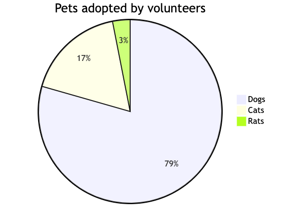
#### Example:
```mermaid theme={"system"}
pie title Pets adopted by volunteers
"Dogs" : 386
"Cats" : 85
"Rats" : 15
```
 **Reusable Pie Chart prompts for you and your team**
You can create custom, standardized [.dinoprompts](/products/dino-ai/copilot/dino-prompts) for Mermaid's Pie Chart Diagrams that ensure consistency across your data team. See [step-by-step guide.](/integrations/mermaid-js/index#creating-mermaid-diagrams-with-.dinoprompts)
***
### Diagram Syntax Guide
#### Basic Structure
```mermaid theme={"system"}
pie
title Chart Title
"Label 1" : 50
"Label 2" : 30
"Label 3" : 20
```
#### Optional Features
* Add `showData` after `pie` to display values
* Title is optional
* Values support up to 2 decimal places
### Data Team Examples
#### Data Quality Metrics
```mermaid theme={"system"}
pie title Data Quality Overview
"Clean Records" : 85.5
"Missing Values" : 10.25
"Anomalies" : 4.25
```
#### Resource Allocation
```mermaid theme={"system"}
pie showData title CPU Usage by Process
"ETL Jobs" : 45.5
"Queries" : 30.2
"Analytics" : 15.8
"Other" : 8.5
```
### Configuration Options
#### Label Position
```mermaid theme={"system"}
%%{init: {"pie": {"textPosition": 0.5}} }%%
pie
"A" : 50
"B" : 50
```
* `textPosition`: 0.0 (center) to 1.0 (edge)
* Default: 0.75
#### Visual Customization
```mermaid theme={"system"}
%%{init: {"themeVariables": {"pieOuterStrokeWidth": "5px"}} }%%
pie
"Group A" : 50
"Group B" : 50
```
### Best Practices
1. Limit to 6-8 slices for readability
2. Order slices by size (largest first)
3. Use clear, concise labels
4. Consider using `showData` for precise values
5. Use meaningful titles
***
**Additional Resources**
For more syntax options and configuration parameters, visit the [official Mermaid documentation](https://mermaid.js.org/syntax/pie.html)
## Related topics
- [Mermaid](/integrations/mermaid-js/index.md)
- [Custom Integration](/developers/python-sdk/modules/custom-integration.md)
- [XY Chart](/integrations/mermaid-js/xy-chart.md)
- [Quadrant Chart](/integrations/mermaid-js/quadrant-charts.md)
- [Snowflake Cost Monitoring](/products/radar/cost-management/snowflake-cost-monitoring.md)
**Reusable Pie Chart prompts for you and your team**
You can create custom, standardized [.dinoprompts](/products/dino-ai/copilot/dino-prompts) for Mermaid's Pie Chart Diagrams that ensure consistency across your data team. See [step-by-step guide.](/integrations/mermaid-js/index#creating-mermaid-diagrams-with-.dinoprompts)
***
### Diagram Syntax Guide
#### Basic Structure
```mermaid theme={"system"}
pie
title Chart Title
"Label 1" : 50
"Label 2" : 30
"Label 3" : 20
```
#### Optional Features
* Add `showData` after `pie` to display values
* Title is optional
* Values support up to 2 decimal places
### Data Team Examples
#### Data Quality Metrics
```mermaid theme={"system"}
pie title Data Quality Overview
"Clean Records" : 85.5
"Missing Values" : 10.25
"Anomalies" : 4.25
```
#### Resource Allocation
```mermaid theme={"system"}
pie showData title CPU Usage by Process
"ETL Jobs" : 45.5
"Queries" : 30.2
"Analytics" : 15.8
"Other" : 8.5
```
### Configuration Options
#### Label Position
```mermaid theme={"system"}
%%{init: {"pie": {"textPosition": 0.5}} }%%
pie
"A" : 50
"B" : 50
```
* `textPosition`: 0.0 (center) to 1.0 (edge)
* Default: 0.75
#### Visual Customization
```mermaid theme={"system"}
%%{init: {"themeVariables": {"pieOuterStrokeWidth": "5px"}} }%%
pie
"Group A" : 50
"Group B" : 50
```
### Best Practices
1. Limit to 6-8 slices for readability
2. Order slices by size (largest first)
3. Use clear, concise labels
4. Consider using `showData` for precise values
5. Use meaningful titles
***
**Additional Resources**
For more syntax options and configuration parameters, visit the [official Mermaid documentation](https://mermaid.js.org/syntax/pie.html)
## Related topics
- [Mermaid](/integrations/mermaid-js/index.md)
- [Custom Integration](/developers/python-sdk/modules/custom-integration.md)
- [XY Chart](/integrations/mermaid-js/xy-chart.md)
- [Quadrant Chart](/integrations/mermaid-js/quadrant-charts.md)
- [Snowflake Cost Monitoring](/products/radar/cost-management/snowflake-cost-monitoring.md)