

What are Mermaid Pie Charts?
Mermaid’s pie charts visualize proportional data by dividing a circle into slices, where each slice represents a percentage of the whole. For data teams, they’re useful for showing distributions, composition breakdowns, and relative proportions in your data.Creating Your First Pie Chart
- Launch DinoAI: From Code IDE, access DinoAI to start creating diagrams.
- Use a Simple Prompt: Tell DinoAI what kind of Pie Chart you want to create. For example:
- Get Your Diagram: DinoAI will generate a complete
.mmdfile with proper Mermaid syntax. - Preview Your Work: Click the eye icon (👁️) to preview your diagram in real-time as you edit.
- Iterate and Refine: Modify the generated
.mmdfile directly, or ask DinoAI to make specific changes.
Example:
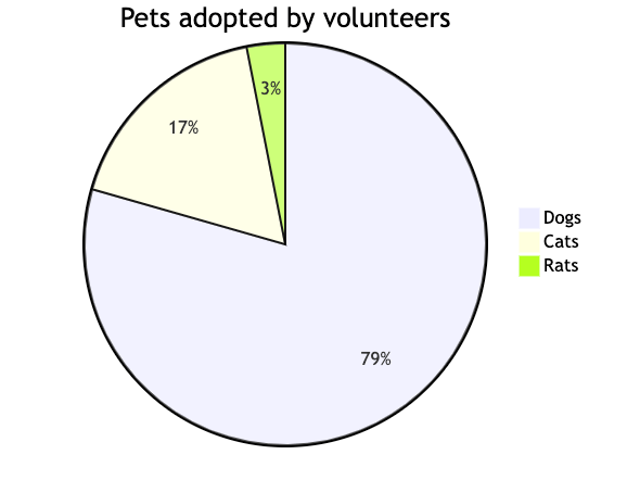
Reusable Pie Chart prompts for you and your teamYou can create custom, standardized .dinoprompts for Mermaid’s Pie Chart Diagrams that ensure consistency across your data team. See step-by-step guide.
Diagram Syntax Guide
Basic Structure
Optional Features
- Add
showDataafterpieto display values - Title is optional
- Values support up to 2 decimal places
Data Team Examples
Data Quality Metrics
Resource Allocation
Configuration Options
Label Position
textPosition: 0.0 (center) to 1.0 (edge)- Default: 0.75
Visual Customization
Best Practices
- Limit to 6-8 slices for readability
- Order slices by size (largest first)
- Use clear, concise labels
- Consider using
showDatafor precise values - Use meaningful titles
Additional ResourcesFor more syntax options and configuration parameters, visit the official Mermaid documentation